Strategic consulting and realisation
Brand identity of digital energy providers
Our contribution:
- Cross-team workshop series to develop the new brand positioning and values
- Research on target groups, competition and category benchmarks
- Redefinition of positioning, mission statement and values
- Derivation of a clear content strategy for the new brand
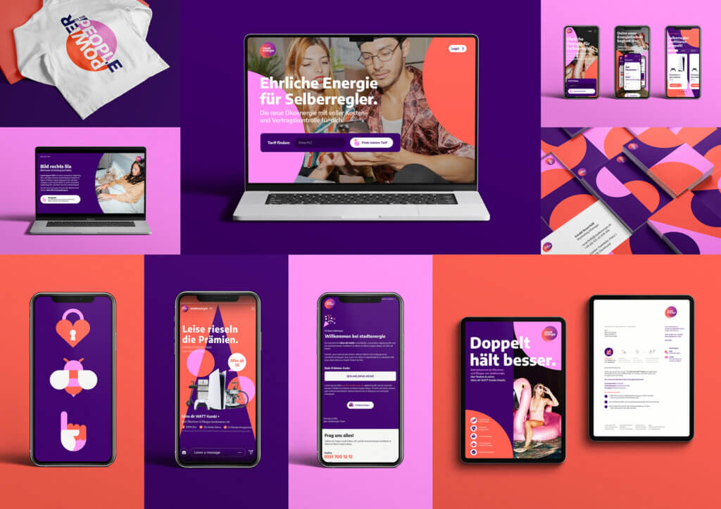
- Implementation of the new identity in all marketing materials
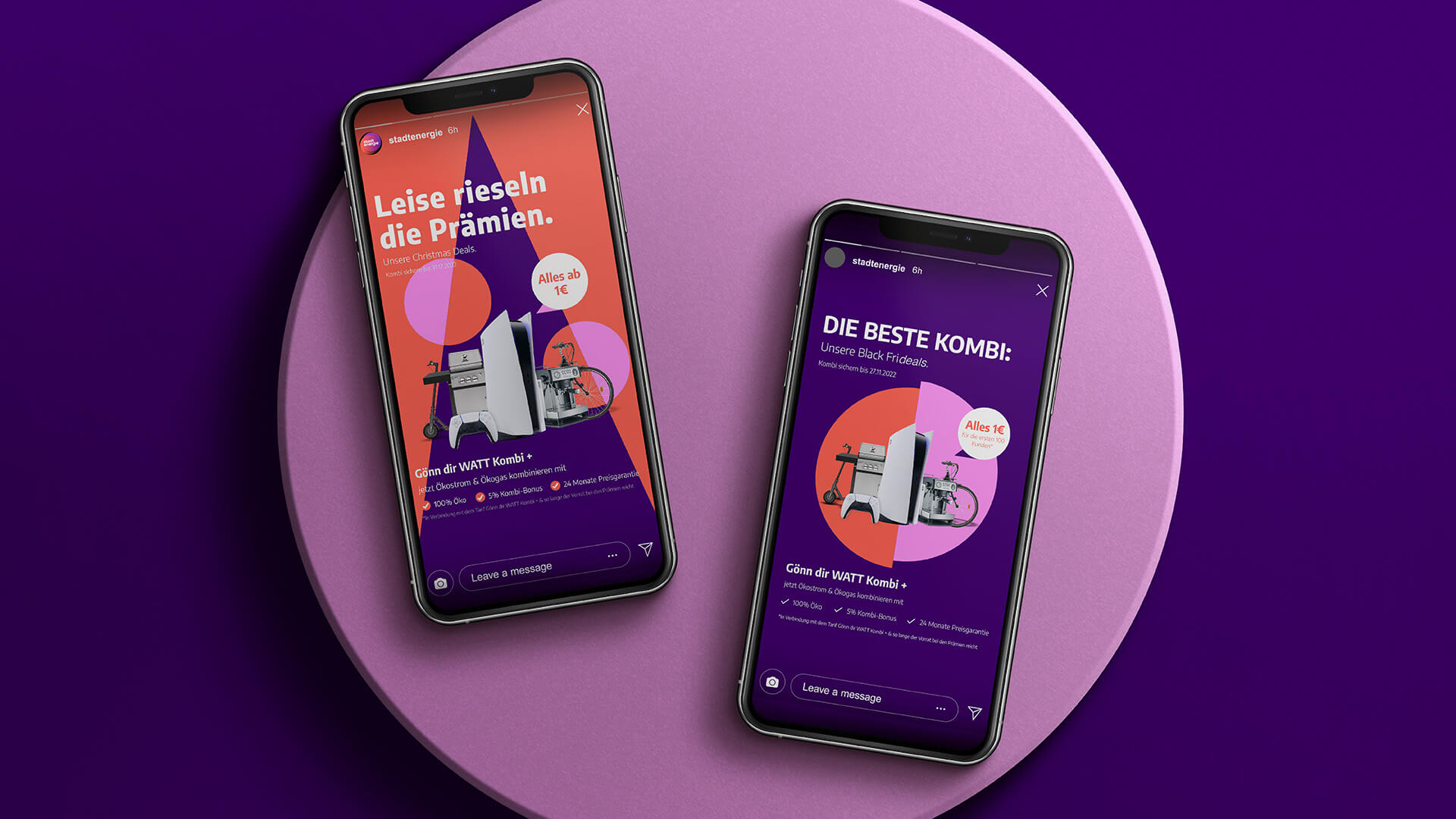
- Initial activation of the new brand in social media and various CRM applications
- Controlling, project management, stakeholder alignment

Strategy
After screening the providers on the energy market, it emerged that every market participant now offers "eco-energy". But the providers hardly differ, especially in terms of communication: colours, imagery, offer, positioning: everything is the same.
stadtenergie is characterised above all by the extremely high degree of networked customer centricity - both in the product and in the processes.
In a series of workshops, the repositioning phrase "Power to the People" was created to emphasise the key role of end customers in the green transition and the collaboration with stadtenergie. This close interplay had to be made tangible for the brand at all levels.
Creative derivation
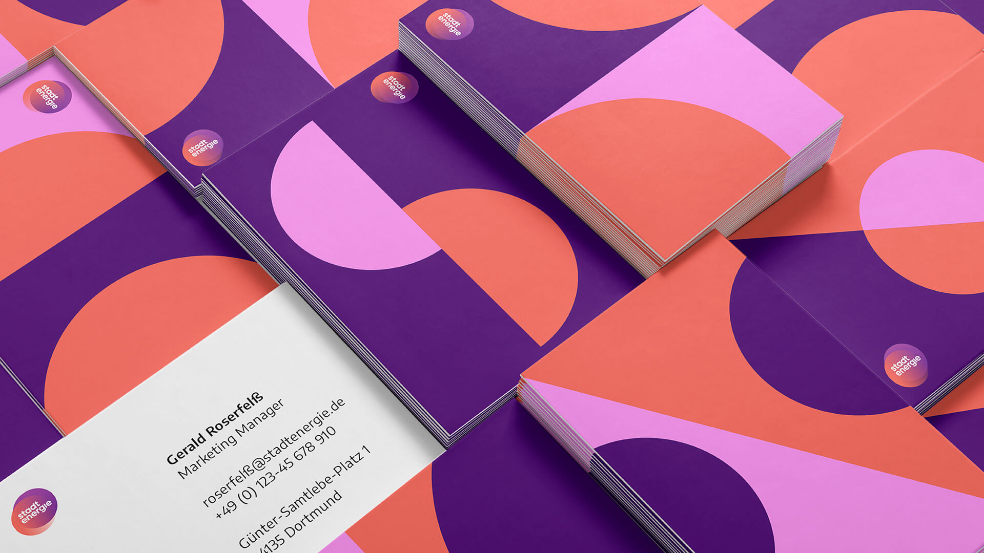
Electricity and gas, city and energy, company and people: the collaboration that stadtenergie stands for always brings two players into close interaction. This togetherness can already be found in stadtenergie's name and was also reflected in the logo introduced when the company was founded in 2020, which was to be retained. stadtenergie can only achieve the energy transition together with its customers. So we made this "togetherness" the driving idea behind the entire new brand identity.
A differentiating appearance for a green energy provider does not always have to look and feel the same.


Application
- Website
- Customer service center
- Imagery
- Case film
- Overview
- Merch


Case Overview


